My images were high quality because the camera was in focus and also because the lighting I used worked with the settings on the camera. As you can see on my first photograph, the lighting was too bright, but after changing the settings, I overcame this in my other images. I knew what kind of shot I wanted for my first photoshoot which is why my images are similar.
I also think that my images look good because of the mise-en-scene that I used; including the clothes, setting and make up. This has helped my to represent my target audience and genre better.
ZOE


In my main photoshoot for my cover page, I experimented with different angles so I had a range of choices to fit with the layout of my cover page. In this shoot, I used a white backdrop as my model was wearing black, so she stood out because of the contrasting colours.
RHYS
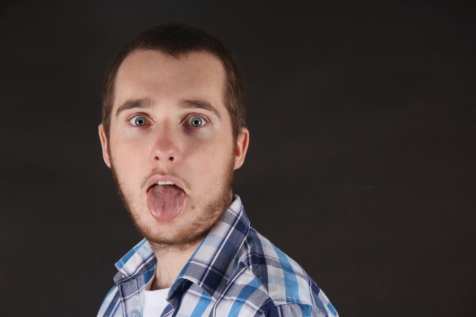


In this photoshoot for my contents and feature pages, I wanted the model to act big and fierce. I chose this model because I knew he would be able to express these actions well being a drama student. I am happy with these photographs mostly because of the expressions and actions in them, but also because of the lighting and contrasting background colour. I feel that these images represent my target audience and genre because of the positions, clothing and quality.
CONTENTS PAGE IMAGES


As drugs are something that is associated with the hip hop genre, I took these photographs to represent the common stereotype that comes with my magazine. They will appear on my contents page.


These images are also for my contents page. I think that these photographs will represent my target audience in terms of fashion and expressions.
FINAL IMAGES

This is my image for my front cover.

This is my image for my feature page.

I will use this image for my contents page main image.


These three images will be used as small images for stories on my contents page.
All of my final images have been edited on Photoshop. I have airbrushed them using my Art Master III graphics board with the paint brush tool of the appropriate colour. This has allowed my models and photographs to look more professional and has also ensured that I represent my target audience.
After putting my pages together according to my flat plans, I realised that they needed more interesting photography that was better quality and better suited my target audience. I decided to do some more creative photography shoots in order to do this.
For the first two images that I will use on my cover and contents pages, I decided to take advantage of the weather and take some photographs in foggy conditions. To make the images have even more of a creepy and mysterious look, I used the iris blur filter and also created a vignette effect using Photoshop to help the vision of the viewer be tunnelled into the subject of the photograph.

1.jpg)
For my feature page, I created an image in Photoshop by using a series of photographs taken in the photography studio. I took photographs of a girl sat on a stool with a saucer in her hand as she looks up with a surprised expression. I then took pictures of her pouring tea from a tea pot into a tea cup, and put these photographs together. I did this using the the Polygonal Lasso Tool in Photoshop to cut out the tea pot, cup and pouring tea on separate layers, then copying them into the first document. Next, I played with the scale of the objects to make it look more 'magical', and then used the warp tool on the tea to make it look odd and gravity defying.

You need to get the analysis on here a.s.a.p.
ReplyDelete