Friday, 29 November 2013

Institution

In order to make a profit, a company or corporation sells products - this is known as an institution. In my case, I am studying magazine institutions but the product could be many things.

In the UK, the total consumer magazines is 2,471 and has an estimated value of £1.4billion. The estimated total of business to business magazines is 3.2billion. Together they will reach revenues of £7 billion by 2014.

Magazine publishing institutions are using new ways of advertising amoungst many new technologies, such as: tablets, mobiles, social media, online, print and live events. This helps to satisfy the consumers needs and allows them to find the information they are looking for on a range of devices.

In order to create more money for the institution,  they also buy independent magazines. This means that the independent magazine will be exposed to a wider audience and therefore more copies will be bought by the readers.


With an audience of 26 million UK adults (two thirds women and 42% men), IPC Media is the largest consumer magazine publisher in the UK. They have over 25 million users across the world each month and are split into three different publishing divisions. One of these is IPC Connect - publishing Woman Weekly which provides digital media in areas of fashion, celebrity, lifestyle, entertainment and TV. IPC Connect reaches approximately 9.4 million women monthly which is roughly 49% of the market place.


Based in Hamburg, Bauer Media Group are a German publishing company. They publish television listing magazines, but their main focus is on Woman's Weekly magazines. Popular magazines that are owned by Bauer Media Group are Bella, Take A Break and many others from a similar market place.

Q magazine and Kerrang! are some other popular magazines that Bauer Media Group brands include. They also have an involvement with the radio and television industry.

BBC create magazines that are mainly based around shows shown on the BBC, but also create magazines which challenge mainstream magazines, like BBC Music.

I think that I would choose IPC Media to publish my magazine as their portfolio doesn't currently consist of magazines in the same genre as mine which would give my magazine more of a chance of being published.

Feature/Double page spread construction


Firstly, I opened an A3 document in Photoshop.


I then added my main image to the right side of the page - chose the right side because I wanted my model facing the middle of the page. I chose this image as I thought it represented my target audience the best because of the quality, model and position. Using the same technique as my main cover image, I perfected the skin with the Spot Healing Tool and airbrushed parts of the face. I then also added smoke effects using smoke brushes with an opacity of 45%. I did this to make the photograph look more interesting and also because it fits with the article.


Next, on the left side, I put in borders using the Rectangle Tool to split up the page and added the heading and sub heading of the article. This will make the page look more interesting and also make it easier for the audience to read.


I then added my article text in two columns on the left. Also, on the right, I added a red box with a low opacity with a quote from the article inside to help it stand out. I added a quote from the article in a larger font so the reader can see part of the article making them want to read more.


Lastly, I added three other images with different poses for the middle column with words describing the images. This also makes the page look more interesting and gives the reader something to look at before reading the whole article making them want to read further.


As with my contents page, after taking some more photography, I decided to use this image on my feature page instead of my last one because the image looks more interesting. I kept the same layout throughout the page, but had to change the gender of the story because of the image change. I think with this change, the page looks more interesting as a whole and will attract my target audience because of this.


Feature Article Draft

How are you?
Good, thank you.

Did you instantly know this was the career for you?
Instantly? No. I've always seen myself doing something ordinary... Although becoming a musician has forever been the goal, I was never sure if I could make it.

What made you want to be a musician?
Watching my idols as a kid and being inspired by them to perform and inspire someone else. Every song has a message that is given through the music, and I think that’s an important thing to have.

Did you ever think you’d become popular?
No - I've always listened to music, but never thought someone would be listening to mine. I guess you just have to believe in your abilities – life is what you make it.

How would you describe your new album?
Hmm... well, it’s different to the majority of music that is around at the moment. It’s a bit old school I guess. I think recent music has lost some of it’s feel - in needs to bring back the meaning of music - which I feel I have done in my latest work. Modern artists seem to sing about anything, whereas I've tried to make sure other people can relate to my lyrics. I’ve loved working on this album, it’s been great.

Where do you get the inspiration for your lyrics?
Life; the choices, the good times and the struggles... Everything around me, and not just my life – the lives of others that I see going on around me. How people interact, their actions and problems that everyone will hit at some point in their lives. I think it’s important to express your feelings and thoughts – whether that be in an artistic way or not.

What is your favourite album you've heard so far?
Probably 2Pac's 'Greatest Hits' album. This is because, as you'd expect, it contains his best songs. The messages he portrayed through these songs are inspiring and they discuss things that are still relevant today.

Do you listen to different artists or genres depending on your mood?
I do. I think different music has the power to change what and how you think about things. For example, if I'm sad or generally down about anything, I will listen to something that will brighten my mood and make me think about better things.

What do you want to accomplish in the next 5 years?
I generally go where the wind takes me, but in the next 5 years I would like to become more well known and show more people what my music is about.


Contents Construction


Firstly, like my cover page, I opened a new A4 document in Photoshop.


Next, I added rectangle shapes creating thin borders splitting the page into 4 parts. This makes the page look more interesting and also makes it easier for the audience to read as it is split off into sections with relevant information in each section. I then overlaid the same grunge lens flare texture over the borders so they looked more interesting.


I wrote the word 'Contents' at the top of the page so it sat on top of the first rectangle. I did this because this is a common convention that is seen on magazine contents pages and makes it more clear to the reader as to what they're looking at. I also the volume and number of this issue in the right side of the rectangle.


Next, I added my main image to the page and used the Rectangular Marquee Tool to select the area of the image I wanted, inversed the selected area and deleted the area that I didn't want in the image making the main image the right size.


I added my other three images between the main image and the top rectangle and used the same selection>inverse>delete technique to get them the right size. I used these images because I think they represent my target audience the best because the models are of a similar age to the majority of my target audience.


I then added the page number and the numbers for each story of the images in a contrasting colour to the background and but a box around them. I also added a black rectangle the same size as the bottom blue one next to it.


Next, I added the information to the bottom section and added a title in the black rectangle of 'What's New?'. This clearly shows my target audience what this part of the page is about and gives them relevant information.


I then added in the main text for the contents page on the right side of my main image. I used different colours and bigger fonts for the headings to show my target audience the more important parts of the text first before they read the whole story.


In the left section of the page, I added a top 20 R&B singles chart with up and down arrows depending if the track has moved up or down the charts. This represents my target audience because they will want to know this information if they are into music. It shows clearly the most popular music and shows what it is doing well in the charts.


After taking more creative photography, I decided to change the main image on my contents page. I kept the layout of the page the same, but had to change the colour of the text on the right so that it was easier to see on top of the image. I also updated the masthead on the top left. I think this image makes the page look more interesting and therefore represents my target audience better.


Cover Construction


Firstly, I opened an A4 Photoshop document.


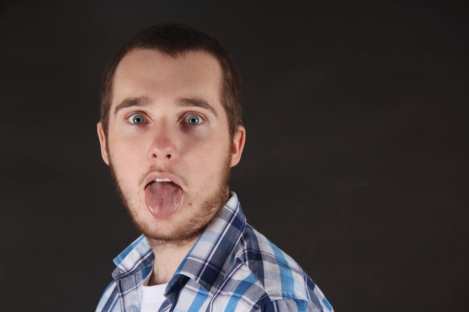
Next, I placed my front cover image into the document. I chose this image because I thought it represented my target audience because of the mise-en-scene and choice of model.


After perfecting the skin with the Spot Healing Tool, I began perfecting my photograph (airbrushing, touching up make up, ect) by using my Art Master III graphics board with the airbrush-style, opacity and size pressure enabled to create a more natural look when I airbrushed the face. Using the brush tool, I selected colours from the face and with a low opacity and flow, I drew over the face. 


I then did the same with the eye make up and lips making it more visible including the eye lashes with a very small brush and a higher opacity and flow. This represents my target audience because they will want to look like my model in terms of make up.


Next, I added the masthead. To make it appear that it is in between the model and the background, I duplicated the image and drew around the top of my models head. I then inversed the selected area (ctrl+shift+I/cmd+shift+I) and deleted the selected area. I moved the duplicated layer so it was on top of the masthead.


I then added a 'sun ray' shape over my model by creating a new layer, drawing it with the Polygonal Lasso Tool and filling the selected area with black. Using the Eraser Tool with a low opacity, I took out areas of the shape where I didn't want it to be a block colour. I then added text onto the shape: 'Zoe Truran' is written in the font Capitals with a drop shadow effect, and 'The start of' and 'Newcomer takes her talent further' is written in Britannic Bold with a drop shadow effect. This made the words stand out more against the background. This makes the main story more visible to the reader.


Next, I added three circles in the top left corner of different opacities to create a background for the text making it stand out to the reader.


I added a bar code in the bottom right corner and extended the white area by drawing a white rectangle behind it. I then added the date, website and price above the bar code. I put the price on this part of the magazine in a small font so the reader can take in the cover of my magazine which will make them want to read further before realising the price.


I added the text for the magazine stories on the left side with the headings in Britannic Bold with grey rectangles behind it making the white text stand out, and red text in Ariel Bold underneath giving some information about each story.


Lastly, I overlaid a grunge lens flare texture over the top with 50% opacity which made the background look more interesting.

After taking some more creative and interesting photography and redesigning my masthead, I created a new front cover that I thought represented my target audience better because of these redesigned aspects. I kept a similar layout to my cover, but added an ink splatter effect in the background on the right. I also made the text on the right smaller, and added a 'poster edition' section at the bottom. I think this design works better with the genre of my magazine and looks more interesting as a whole.


Original Images

My photoshoot turned out successful. My final images look professional and also represent my target audience. This is because of the style and choice of models, the location, lighting and quality. My photographs also represent my genre and purpose of the magazine.

My images were high quality because the camera was in focus and also because the lighting I used worked with the settings on the camera. As you can see on my first photograph, the lighting was too bright, but after changing the settings, I overcame this in my other images. I knew what kind of shot I wanted for my first photoshoot which is why my images are similar. 

I also think that my images look good because of the mise-en-scene that I used; including the clothes, setting and make up. This has helped my to represent my target audience and genre better.


ZOE


In my main photoshoot for my cover page, I experimented with different angles so I had a range of choices to fit with the layout of my cover page. In this shoot, I used a white backdrop as my model was wearing black, so she stood out because of the contrasting colours.

RHYS


In this photoshoot for my contents and feature pages, I wanted the model to act big and fierce. I chose this model because I knew he would be able to express these actions well being a drama student. I am happy with these photographs mostly because of the expressions and actions in them, but also because of the lighting and contrasting background colour. I feel that these images represent my target audience and genre because of the positions, clothing and quality.

CONTENTS PAGE IMAGES


As drugs are something that is associated with the hip hop genre, I took these photographs to represent the common stereotype that comes with my magazine. They will appear on my contents page.


These images are also for my contents page. I think that these photographs will represent my target audience in terms of fashion and expressions. 

FINAL IMAGES


This is my image for my front cover. 


This is my image for my feature page.


I will use this image for my contents page main image.


These three images will be used as small images for stories on my contents page. 

All of my final images have been edited on Photoshop. I have airbrushed them using my Art Master III graphics board with the paint brush tool of the appropriate colour. This has allowed my models and photographs to look more professional and has also ensured that I represent my target audience.

After putting my pages together according to my flat plans, I realised that they needed more interesting photography that was better quality and better suited my target audience. I decided to do some more creative photography shoots in order to do this. 

For the first two images that I will use on my cover and contents pages, I decided to take advantage of the weather and take some photographs in foggy conditions. To make the images have even more of a creepy and mysterious look, I used the iris blur filter and also created a vignette effect using Photoshop to help the vision of the viewer be tunnelled into the subject of the photograph.


For my feature page, I created an image in Photoshop by using a series of photographs taken in the photography studio. I took photographs of a girl sat on a stool with a saucer in her hand as she looks up with a surprised expression. I then took pictures of her pouring tea from a tea pot into a tea cup, and put these photographs together. I did this using the the Polygonal Lasso Tool in Photoshop to cut out the tea pot, cup and pouring tea on separate layers, then copying them into the first document. Next, I played with the scale of the objects to make it look more 'magical', and then used the warp tool on the tea to make it look odd and gravity defying.