Tuesday, 30 December 2014

Kensa Website Construction

Throughout the construction of my website, I followed and developed the design of my flat plans to ensure that I would create a website that my target audience would find attractive and appealing. For this process, I decided to use Adobe Dreamweaver so that I could create an effective design. So that I could link my pages together and use the images that I needed in the right place, I created a new folder where I kept all of the files I needed. I did this before I started creating my website so that I would be able to find images and create links easily and quickly.

To start, I made a new website in Dreamweaver and chose the page size. I also edited the options that would change the style of my website.

Because all of my webpages had the same layout with an image for the background, text on the right, masthead at the top and buttons on left, for each page, I would only need to change the image and text; other than Winter is Coming because I would need to add my video and the Contact page because I would need to edit the location on the maps. As this was the case, I found it easier to edit the pages through the code once I created the standard layout for each page.


I followed my flat plan design for the layout of the pages and focused on the navigation and genre representation because that is what my target audience thought was important. 

Once I had added the basic content and was happy with the layout of the home page, I duplicated this page five times and renamed and edited them appropriately. This meant that I could then edit the other pages with the same layout and design.

I put my masthead at the top of each page in the middle so that my audience would be able to recognise it instantly. I edited the masthead using CSS to change the styling of the text; I made it white with a black drop shadow so that it would stand out against the background images. I also used the CSS to create the low opacity white box behind the text, and basic code to add text boxes and images in the right places. So that I could add my content and check it was in the right format, I used Dreamweaver's split screen design mode to that I could view and edit the code and layout at the same time.


For the page below, I added my video that I filmed and edited. To do this, I researched what code to use to include it next to the text:

                           <video class="vid" controls>
                              <source src="video/AmyJoMovie.mp4" type="video/mp4">
                            </video>

I added this code in the text container for this page. Below is the CSS for the video:

.vid {
width:720px;
height:380px;
padding:0px;
margin: 0px 4%;
}


After I had finished buiding and checked my website, I uploaded it with my domain name.


Website Institution

In order for my target audience to view my website, I will have to get my website hosted by a web hosting company. This is a company that provides space on a server that can be rented by clients so that their website will be accessible to the world wide web. From researching web hosting companies, I found a company called Dataflame who were voted #1 UK web host. To get my website hosted by this company, the prices would start from £1.99 per month.

Other local companies such as Cornish Hosting Company will host websites starting at the same price. I will probably host my website with Dataflame because they are more well known for their services and offer the same price.

Website Audience Research

In order to create a successful website, I needed to include what my target audience wanted to see. I created a SurveyMonkey so that I could find out and research their needs.


My results show that the audience that answered my survey were between the ages of 18 and 24. As this is the age of my target audience, the results from the survey will more accurate and helpful when it comes to making my website appeal to the right audience.


These results show that the respondents were predominantly female, which again is the gender of my primary target audience. This means that my website should appeal to mainly female viewers.


For this question in my survey, I added 'Cornish' as a response so that I could see how many of the people who answered were interested in a Cornish regional magazine website in particular. 100% of the responses were 'Cornish', which means that I will need to include content that will represent them. The reason for this ethnic group being selected the most is probably because I shared my survey on Facebook, and the majority of my friends are from Cornwall.


From this graph, I am able to see that my target audience is between C1 and C2 in terms of their social grade. Again, the lack of range could be because of the people who filled out my survey from my friends on Facebook. I will have to take this into consideration when creating my magazine so that I include content that these social grades will be interested in.


Probably because of the lack of diversity in Cornwall, these results are very unbalanced. Nevertheless, I will make sure that my magazines is aimed primarily at heterosexual females so that I can portray my audience precisely. 


The colours the audience want to see of my website are black, white and cream. This is probably because the class of audience will want to see more elegant and fashionable colours on the website.


The text style that my audience want to see is sophisticated. Again, this is probably because of the class of the audience and they want to see elegant and feminine fonts.


The target audience want to see stories about fashion, lifestyle and events/entertainment on the website. This means I will have to include stories about these areas so that the content of the website will appeal to and interest the target audience.


These results show that speed, navigation and genre is important to the audience. It's important the the website is easy to navigate, so it will need to have a fairly simple layout. The audience want the website to represent the genre well so that the content appeal so them. Additionally, it's important that the webpages don't take too long to load because the audience won't want to wait very long for the content to appear.


My audience said that they would rather see images over video. This means I will have to include mainly images throughout the website.

Website Draft Articles

Unique Boutique

Tucked away in the town of Bodmin, The Old Tea Chest offers a unique collection of gifts, accessories and jewellery. This boutique has kept the traditional Cornish style and heritage within its products of pasty shaped earrings and soaps and Celtic ornaments. This is a place where a shopper can find individual styles and quirky gifts that will suit any occasion.

For birthdays, Christmas and anniversaries, there is sure to be a perfect gift within the unique jewellery section. From hand made friendship bracelets to sterling silver and precious stones, which make up the range of products as well as ranging from traditions necklaces to toe rings and anklets.

If in search of something a bit more unusual, there are a selection of gems, crystals and birth stones to add a personal touch to any gift. Find gem stones that encourage health, power, wealth and luck to give someone just what they are looking for.

Be sure to also find the niche fashion trends such as henna tattoos and hair dye of all the colours of the rainbow. With unique scarves and matching bags, assuring an individual style that no one else will be wearing! 

Step inside The old Tea Chest to be inspired by it’s vintage style. Discover rare candles and burners with scented oils to brighten the essence of your home; as well as classic ornaments and clocks to bring the finishing touches to your rooms.

With every genuine product you can certain that there will be doubtless quality and excellent value; which is very important with Christmas around the corner. There are a new range of Christmas products including lights, baubles and gifts just in time for the festive season. And just to make it more original, this boutique is guarded by a black cat called Maisy who lives in the window.

________________________________________________


Winter is coming

Get inspired by Kensa’s must have 2014 winter fashion collection for your new winter wardrobe. 

This year’s winter style is all about the big knit jumpers, cosy coats and a pair of snug ankle boots. Although a white winter can’t be promised in the land of Cornwall, that doesn’t mean dressing to impress for the frosty weather to come isn’t necessary! With Kensa’s winter fashion collection, you’re sure to be inspired for your 2014 winter wardrobe.

To stay warm and stylish this winter, Kensa reveals the must have accessories and outfits and where to shop for the latest fashion and best deals. Not only have we uncovered the best deals from popular brands, but also where you can shop locally in original boutiques and stores for you to add unique accessories to your winter look.

________________________________________________


A Cornish Christmas

Cornwall is looking forward to another festive year for 2014 with many Christmas markets and switch on of the lights.

Cornwall has lots of festive lights to look forward to all over the county, with impressive and traditional lights in the city of Truro; and more unique display from Padstow. Other festivities include the Christmas lights of Looe and Liskeard which incorporates lantern processions and carnivals.

Like previous years, the Mousehole Christmas lights are expected to be particularly special; where you will see the perfect harbour village in a stunning Christmas glow, which includes a light display in the harbour waters. The quaint village of Mousehole, situated just 3 miles of Penzance, is lovely to visit any time of year, but is particularly famous for it’s Christmas atmosphere. This year, the community will be lead in festive song by the Carolaire Choir and Pendeen Silver Band; so be sure to make room for the 51st year of Mousehole Christmas lights in your diary.

________________________________________________


The Magical Coastline

Cornwall is famous for it’s unique and varied beaches that are so different in character. The iconic sandy beaches of the North Coast with cliffs and sand dunes are great for surfing due to the Atlantic swell and wind; which is a comparison to the South Coast’s legendary landscapes with sheltered coves and harbours.

These beautiful bays are the ideal location for bird watching, relaxing or for exploring; with beaches that are dog friendly, great for surfing and perfect for the family. 

Although it’s coming up to winter time, the golden sand and stunning coastal walks can still be appreciated in the fresh, cold weather. You don’t need the summer weather to take in the mesmerising coastline. The best reviewed beaches and coastal walks to do this time of year include Perranporth, Daymer Bay to Polzeath, Watergate Bay and nothing is better than enjoying a hot chocolate on Constantine Bay!

Monday, 29 December 2014

Kensa Billboard Construction

To create my Billboard, I firstly opened one of my images in Photoshop and changed the canvas size (Image>Canvas Size...). I edited the width of the canvas so that it was three times as wide and the first image I was using (111.76 x 3 = 335.28). I did this so that I had enough space on the document to add another image of the same size on the opposite side as well as an equal amount of space in the middle for information about my magazine.


I then moved the first image to the left and placed my second image (File>Place...>Select File) and moved it to the right, leaving 1/3 blank in the middle. I chose these images because I think they are interesting with a narrative and fashion style, but also represent my regional genre. I made this area black by adding a rectangle using the Rectangle Tool with the colour black selected.


Next, using the guides to make sure everything was in line, I added the masthead from my magazine 'Kensa', to the centre of the image. I used the Rectangle Tool to create a thin line above the word in white and then duplicated the layer and moved the second one underneath the word. I did it by duplicating the layer so that I could make sure both the lines  were the same. I created a small square, again using the Rectangle Tool and rotated it so that it looked like a diamond shape. I moved this shape so that it was above the masthead in the centre. Below the masthead, I added text to specify what my billboard was advertising: 'Cornwall's own fashion magazine.'


Lastly, I added the website of my magazine to the bottom. 

Below is my final Billboard:


I am pleased with this design and think that it will represent my target audience well. I think the imagery in particular represents both genres; the model represents fashion and the surroundings represent Cornwall. I like the layout of the magazine and I think that by splitting the billboard into thirds allowed the design to be a clear and simple but still effective.

Billboard Institution

In order for my target audience to find out about my magazine, I will have to position my billboard in places that they are likely to see it. This will include supermarkets, shopping centres and bus shelters and on mobile billboards in Cornwall. I will need to get my billboard printed to a large size so that it is visible from a distance. I have researched local printing companies to find out if they print billboards and compare their prices.

The companies that I found were:

- Phoenix Print
- St Austell Print
- Mid Cornwall Print

The quotes that the companies gave ranged from £350 - £650 for 50 prints and £1200 - £1700 for 400. Because I won't need a large amount of printed billboards, I would choose the cheapest quote for less prints.


Billboard Audience Research

In order to create a successful billboard, I needed to include what my target audience wanted to see. I created a SurveyMonkey so that I could find out and research their needs.

My results show that the audience that answered my survey were between the ages of 18 and 24. As this is the age of my target audience, the results from the survey will more accurate and helpful when it comes to making my billboard appeal to the right audience.
These results show that the respondents were predominantly female, which again is the gender of my primary target audience. This means that my billboard should appeal to mainly female viewers.

For this question in my survey, I added 'Cornish' as a response so that I could see how many of the people who answered were interested in a Cornish regional magazine billboard in particular. 100% of the responses were 'Cornish', which means that I will need to include content that will represent them. The reason for this ethnic group being selected the most is probably because I shared my survey on Facebook, and the majority of my friends are from Cornwall.


From this graph, I am able to see that my target audience is between C1 and C2 in terms of their social grade. Again, the lack of range could be because of the people who filled out my survey from my friends on Facebook. I will have to take this into consideration when creating my magazine so that I include content that these social grades will be interested in.

Probably because of the lack of diversity in Cornwall, these results are very unbalanced. Nevertheless, I will make sure that my magazines is aimed primarily at heterosexual females so that I can portray my audience precisely. 
The colours the audience want to see of my billboard are purple, green and black. This is probably because the class of audience will want to see more elegant and fashionable colours on the website.
The text style that my audience want to see is sophisticated. Again, this is probably because of the class of the audience and they want to see elegant and feminine fonts.

These results show that my audience want the setting of my photography to be in an outdoor location. This is probably because the audience will want to see parts of Cornwall as well the fashion. 


The audience said that they want to see medium shot types for the photography on my billboard. Again, this is probably because the audience want to see the Cornish setting rather than just the model.

Sunday, 28 December 2014

Kensa Feature Page Construction

To create my Feature Page, I opened a new A3 document in Photoshop and rotated it 90° (Image>Image Rotation>90° CW). I then placed an image into the document (File>Place...>Select File) and resized it so that it fit A4 by dragging the corners of the image, making sure that I was holding the shift key so that it stayed proportional. I chose this image for my contents page because it represents my feature article, is in a fashion photography style and is taken in a Cornish Location.


In the same style as my Contents Page, I added my masthead to the top right of the page so that it stays clear to the reader as to what magazine they are reading.


Next, I created the content of the left page. I added the title of the article to the top using fashionable fonts that represent the story. I then built the text box for my article using the Rectangle Tool. I created a dark grey square with a Soft Light effect and an opacity of 24% so that the white text would stand out against the image. I then created a white outline around the text box, again using the Rectangle Tool to create four thin rectangles to frame it. I created another thin rectangle down the middle of the text box to separate the two columns of text. I created a small square using the Rectangle Tool and rotated it so that it looked like a diamond shape. I duplicated this shape and moved them so that one was above the title and the other was below the text box. Lastly, I added a page number to the bottom left of the page.


Below is my final Feature Page:


I am happy with the final design of my feature page and think that the layout is clear and make the article easy to read. I think it represents my target audience and genres, particularly through the imagery.

Feature Page Draft Article

The obsession with the vintage style amongst the younger generation seems puzzling. We live in a time where ‘newer is better’, but in the fashion industry this is clearly not the case as the older styles continue to make comebacks. The latest rush of the vintage trend proves that unlike technology, fashion doesn’t have to be new to make it the most desirable.

If you’re more of a modern-dresser, you might wonder why vintage-wearers would want to look so out dated rather than dressing smart and chic. While everyone doesn’t enjoy the vintage trend, it’s worth knowing what the inspirations for the craze are. Each outfit holds historical implications, which can be considered when you see the next young girl in a embroidered chiffon dress.

Usually referring to 1920’s inspired fashion, the term ‘vintage’ is also used to describe anything old until the 1980’s. It’s not to be confused with grunge, which refers to the 1990’s trend of oversized sweaters and flannel shirts; although there are similarities between the styles. They can both be found at second hand shops at more economical prices. Additionally, wearing clothes from another era has been effected by nostalgia as it can be seen as an escape from every day stresses. However, there is one considerable difference between the recent vintage and grunge trends: grunge-dressers will possibly remember wearing the style once before in the 1990’s, but the vintage-dressers most probably weren’t around in the 1920’s for the first vintage trend. One celebrates youth, and the other celebrates historical pride.

The 1920’s vintage style represents a time where there was indulgence, rapid economical growth and change when the First World War was finally over. This was a peaceful period between the wars when people had days of prosperity and fun. The Modernist Movement took shape and the urban environments blossomed and there was cultural excitement when artists and musicians bloomed in new ways.

The main reason why women have returned to the style is because it speaks for a time where women gained new rights and roles in society. This was a revolutionary decade for women as they were finally given the same political rights as men. Women could then wear what was considered ‘rebellious attire’ with haircuts that weren’t traditionally acceptable. 

This period has proved that it is not irrelevant or forgotten; it is however greatly respected. There is no better way to keep this significant decade alive that through the art of fashion – a stylish and classy way to do so.

Friday, 26 December 2014

Kensa Contents Page Construction

To create my contents page, I opened a new A4 document in Adobe Photoshop. I then placed one of my images in the document (File>Place...>Select File), and resized it so that it fit A4 by dragging the corners of the image, making sure that I was holding the shift key so that it stayed proportional. I chose this image for my contents page because it is intriguing and also leaves enough space for text.


Next I added the word 'Contents' at the top of my image. I arranged the word so that it sat behind the flowers to make it seem as though it is under the archway with the model. I created this effect by firstly adding a gradient effect to the word so that the top and sides were grey. This made it seem like the word had shadows from the walls around it. Also, to send the word back in terms of depth, I cut out the flowers from the image using the Polygonal Lasso Tool and pasted them onto a new layer. I moved this layer so that it was on top on the text layer, giving the impression that the text was behind it. This effect makes the overall page look more creative and interesting.


I then began to add the content to the page using the Text Tool. I arranged the text so that there was a column of page numbers on the left and the text on the right, with the heading in capitals and the information about the page in lowercase.


Next, I added more content to the bottom of the page. Because of the colours at the bottom of the image, I had to add a rectangle using the Rectangle Tool so that the text stood out against it. I made the shape a dark grey colour with an opacity of 21% so that the image could still be seen beneath it. I then added text in the same style as the previous.


I then added my masthead and the date of the issue to the top right of the page so that it is clear to the reader as to what magazine they are reading.


Below is my final Contents Page:


I am very pleased with this design and think it will represent my genres and target audience well. I think the model and the colours in the image work well to represent fashion and also to show the nature in Cornwall. I think the layout works well to show the text clearly and to make it interesting to read and appealing to look at.

Thursday, 25 December 2014

Kensa Cover Page Construction

To create my cover page, I firstly opened a new A4 document in Adobe Photoshop. I then placed one of my images in the document (File>Place...>Select File), and resized it so that it fit A4 by dragging the corners of the image, making sure that I was holding the shift key so that it stayed proportional.  I chose this image for my cover page because it shows both my fashion and regional genres, has a common shot type that is used on magazine covers such as Vogue, and leaves room for the masthead and other text around it.


Next, I added the my masthead at the top of the image. I arranged the word 'Kensa' so that it almost filled the width of the page. I chose this font because it is similar to other fashion magazines such as Vogue and Harper's Bazaar and it elegant and feminine. I also chose the pale blue colour from the model's dress because it fits with the colour scheme and stands out against the background colour. Additionally, I added the date, price and website under the masthead in a small font in white.


I then added the word 'escape' at the bottom of the page. I found that other fashion magazines such as Vogue use a word that suggests the main themes in particular issues of their magazine at the bottom of the cover page. I chose this word because Cornwall is seen to be relaxing and slow placed; a place to 'escape' to, and also because it will make my audience think that they can relax and unwind by reading my magazine. I added a line underneath the word and on the left of the 'p' by using the rectangle tool in the same cream colour as the text. By using the Pen Tool, I created decoration that fits with the idea of the z-pattern.


I then added the text around the left and right of the model using three main fonts and three main colours so that the audience would find it more interesting to read. I positioned the text in this way because I saw that it was a common convention of other fashion magazines such as Vogue.


I added a bar code on my magazine on the bottom left corner because I found that this was also a common convention on magazines.


Below is my final cover:


I also experimented with other photography for my cover page and thought that this image may be more suiting to the cover because of the colours and lighting. However, after asking my target audience and peers what they thought of the designs, the majority preferred my first design.


Original Images

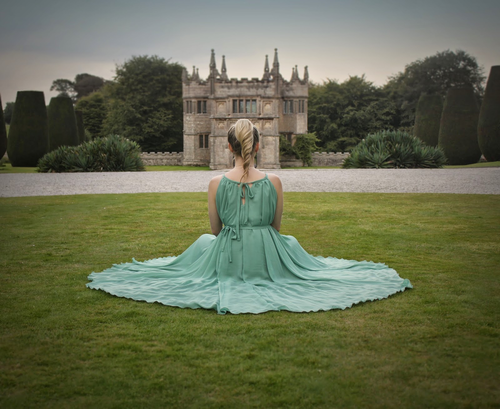
Below are some of the images from my first photo shoot at Lanhydrock:


I think this photo shoot was successful in that the colours work well together and the idea of the surroundings and the model being contrasting with one another was achieved. I think the images represent both Cornwall and fashion. I have used mainly medium to medium/close up shots. I have done this rather than focusing on close up shots because I wanted to capture the models clothing as well as some of her surroundings. I think the natural lighting worked well to capture the image, although by using an outdoor lighting kit, I may have been able to catch more shadows and depth.

Below are two of my images from my second photo shoot at Lanhydrock:


I think that these images are strong in terms of lighting and colour and show off the beauty in the gardens. These images represent Cornwall well because of the nature and beauty within the surroundings. I have used mainly medium shots so that I could focus on the surroundings and the flowers that are in bloom. Because the lighting in these photographs is more striking than the previous images, I was able to capture more depth and shadows within the scene.

Below are some of the photographs from the photo shoot in the corn field:


I think that these images are more creative in that they have more of a narrative element to them. Because of the poses of the model, it appears that she could be trapped or trying to escape. The main theme in these images is curiosity; this is shown by the models expressions. I think the use of outdoor lighting worked well to create depth in the image which is important because the models surroundings is mainly green. I have experimented with different shot types in this photo shoot. This is because I wanted to capture the clothing for the fashion genre, the surroundings for the regional genre, but also the expressions so that the images were more narrative.

Below are some other images that I have taken at different locations to use for my website: