Tuesday, 29 October 2013

Researching Mise-En-Scene for Photographic Shoots

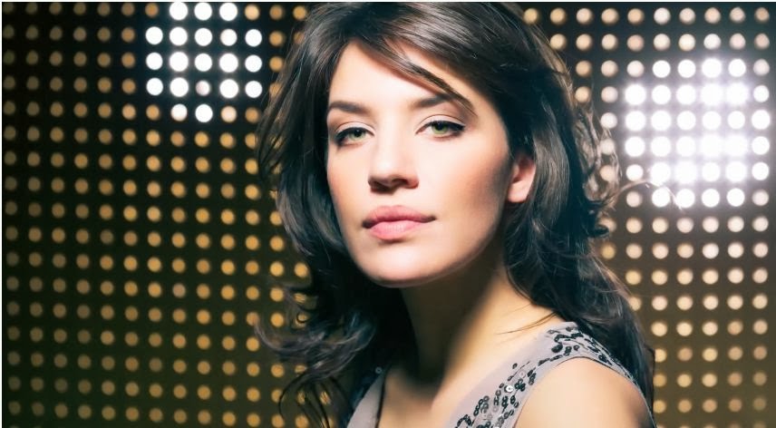
In order to get successful photographs, I will need to plan the Mise-en-scene for my shoot. This includes the settings and props, costume, hair and make up, facial expressions and body language, lighting and colour as well as the positioning of characters or objects within the photograph. For the genre of my magazine (R & B/Hip-hop), the Mise-en-scene has to appeal to the target audience of this genre of music. To do this, I have decided to look at Mise-en-scene in the photographs of a popular artist in R & B music: Rihanna - particularly from her 'Loud' album. I will look at her style of clothing and make up, the general settings, as well as how she poses.

Red is a reoccurring colour in Rihanna's music videos, and album/single covers in this album. This colour represents energy, danger, strength and power as well as passion, danger and love. Rihanna's hair and lips are often red, as well as some of the surroundings in her photo shoots and videos, such as poppies. In this case, the colour red could be associated with strength and power because people may see her as a powerful woman, in the sense that she is a role model and can make styles of fashion and make up popular. The colour red could also represent passion and love, as in her passion for music, her fans passion for her music or her fans passion and love for her.


I began by researching Rihanna inspired make up tutorials on YouTube. This is a popular make up tutorial that people have made videos on, but I thought that this one by Pixiwoo was one of the best.


During this tutorial, it shows ways to apply make up and what colours and products are best to use. Because I won't own all of these products, I will use the most similar matches I can find. I found that the eyes are quite natural in terms of colour, and emphasise the eye crease, lash line and lash length. Because of this, the dark coloured lips stand out more, whereas if the eyes and lips were both dark/bright colours, the look would be too much and it would take away any natural look. Rihanna's make up look puts emphasis on her natural features such as; brow bone, eye crease, eye lashes, cheek bones and lips which makes her look feminine and radiant. To recreate this look, I have learnt that foundation will be needed to give the skin a flawless look, and concealer is used to neaten and perfect areas, such as under the eyes and around the lips. I have also learnt that to give a softer and more smoky look to the eyes, dark eye shadow can be used over the top of liquid/cream eye liner to soften the definite line. Another technique I have learnt is that by using a darker eye shadow around the crease of the eye, it makes it appear deeper and puts emphasis on it. A powder is used as a final touch for the skin to stop it from looking too shiny - this is an important part of the tutorial, especially in my case as the lighting/flash that I may use in my photo shoot could emphasise the shininess of the skin which will not appear natural. In this tutorial, false eye lashes are also used. This makes the eye lashes appear thicker and longer, but I don't think this is important to create this look.


In order to recreate this Rihanna inspired look, I will need:


  • Foundation
  • Concealer
  • Powder foundation
  • Brown/Bronze eye shadow
  • Blusher
  • Highlighter
  • Eye brow pencil
  • Liquid eye liner
  • Black eye shadow
  • Mascara
  • Red lip pencil
  • Red lip stick
  • False eye lashes
  • Eye shadow, foundation, blusher and concealer brushes

Next, I looked at a hair tutorial which has been seen on Rihanna. This look has been inspired by 80's curly up-do hairstyles.


This is a quick and quite an easy hairstyle to do. I learnt that the easiest way to curl the hair for this look is to firstly put it in a pony tail, put in into sections and curl one section at a time, and then curl the front section separately. I also find out that by putting sections of the hair forward towards the face from the pony tail makes the hair look bigger and more full even if the models hair is thin. To finish this Rihanna inspired hair style, a bow is tied around the head. The colour of the bow depends on what stands out best against the hair colour of the model.


To recreate this hairstyle, I would need:

  • Heat protecting spray
  • A curling wand
  • Hair spray
  • Hair band
  • Bow

I will be using female models for my photoshoot in order to create make up and hair like the ones above. In my magazine, this will appeal to females in my target audience because they will want to look this way too, and also males because they will find them desirable. This supports Laura Mulvey's Theory that the role of female characters in traditional media products functions on two levels: "As erotic objects of desire for the characters within the story, and as erotic objects of desire for the spectator.”  (Mulvey, 1975).

Using sex to sell is one of the most common tactics used on any media product. It is easy to attract a male audience by having an attractive female on the front cover. However, this often does not make female readers avoid these magazines because some women may feel that the woman represents them because they want to be seen as an attractive woman themselves.

The following are two of my own images that I have produced after learning about the mise-en-scene and lighting.


This image is a close up portrait that I produced in the photography studio. With this image, I concentrated mainly on the lighting and editing on Photoshop. 


This image is a medium close up portrait that I also produced in the photography studio. I concentrated on the make up, hair and clothing with this shot more than I did the first image to get a more professional looking image that will represent my target audience.

I have edited both of these images in Photoshop using my Art Master III graphics board to get a more detailed and precise airbrushed look using the paint brush tool of an appropriate colour.

From the previous research, I learnt new make up techniques for photoshoots especially that help certain features stand out. These make up techniques are useful and helped me to create the look that was necessary to represent my target audience. I have also learnt techniques from my Researching Photographic Techniques post which have helped me to create more professional lighting for portraits. As well as the make up techniques, this has helped me to create images that will represent my target audience because of the quality.


Researching Photographic Techniques


In this video by The Slanted Lens, the basics of a one light set up is shown; including how to create a highlight to shadow ratio with a contrasting background shadow. It also gives some make up ideas for the model and shows how using a see through/netting material can be used to give a softer look to the image as a whole. They have mainly taken their images through stills of video footage of the model moving her hair.

I have learnt some useful points from watching this video. First of all, J P Morgan describes the similarities of a face and a ball and uses a ball as an example to show how the light will hit the object and the shadow that it will cause. As a ball and a face are both round surfaces, this helps show a more simple version of how the light will change the shadows on the face of the model and also the background. I have learnt that the highlight to shadow ratio is important and that it is important not to have too much of one - by having the right amount of both, it gives a more natural light to the photograph. I have also learnt about how to create a contrasting background shadow - by having the shadow of the soft box ending on the background where the shadow of the face starts, the light creates a shadow on the background the side that the face is highlighted, and a shadow on the face the side the background is highlighted. Additionally, I have learnt that by filming the model move their head or hair, effective stills can be taken.

I would like to use these techniques in my own work to get effective shadows and highlights, and also the use of material and make up that was experimented with towards the end of the video. I like the make up that was used in this video - the first part made the model look more natural, whereas the second part made her  look more bold and made a statement. The use of sequin material was interesting - I would like to experiment with this in my own work as I like how it can give a softer look to the image, and I also like the photographs that were taken where you could see the model through the material.


Fashion, glamour, modelling, posing and lighting are all covered in this video to get beauty fashion portrait shots. This tutorial includes good techniques for the background, model, lighting/mood lighting, camera settings, materials, poses, make up, fashion and for final editing to the photograph using Photoshop and Lightroom.

This tutorial was full of useful techniques that I would like to use in my own portrait photography. Firstly, I learnt that a good way to separate the model from the background is to use strobe lights behind the model that will be in the photograph - this is good for rim lighting and ambience. In this tutorial, it is shown how a dark background is effective for this low key shoot - in this particular photo shoot, the main light was put around 15 ft away from the background to make sure that the light was on the model without spilling onto the background.

This tutorial gave some good tips for camera settings for portrait photography when using this kind of lighting. I have learnt that by using lower f/stop numbers, it decreases the background sharpness. In the video, it was recommended to use a low ISO, moderate aperture and a relatively fast shutter speed. For this photo shoot, they used and ISO of 100, f16 for the aperture and 1/250 shutter speed.

This video was also useful for make up techniques and fashion ideas. It was suggested to use simple and natural make up so that it is not distracting, but to use more colour than usual to create more depth and colour as the lighting tends to wash out the face. They advised to add make up that puts emphasis on the eye crease, eye lashes, eye brows and cheek bones so that the features of the face are brought out. They also suggested neutral, reflective clothing - in their photo shoot, a beige dress with sequins was worn.

Photoshop and Lightroom techniques were also given in this tutorial. To take away any unwanted background features, I learnt that by selecting the area with the Lasso Tool and pressing shift+F5, the area can be given a content aware fill. This can also be used on the models skin to take away any large blemishes or birth marks, and smaller blemished can be taken away by using the Spot Healing Tool. To add final touches to the face, I have learnt
that the Dodge Tool can be used (on Mid-tones settings with a 50% exposure) around the eyes to brighten them, and the Burn Tool can be used with the same settings to smooth the make up and add shadows around the eyes where they are wanted. In this tutorial, they also used Lightroom to create a warmer/cooler glow and by using the Luminance Tool, made the skin more smooth and radiant looking. A blue shadow was also added to give a glamorous look to the model without looking washed out; the shadows and contrast were made higher to make the model more defined.

I would like to use many of the techniques that I have learnt for this tutorial in my own work. I like the use of strobe lights that are used to break up the background - they create a more interesting image, and make the lighting more effective. I also like how the pegboard was used in the background with the strobe lights - the lights shone through the holes making the background more interesting. I also like the modelling for this photo shoot - I like the use of eye contact with the camera and the hair movement. I learnt a lot about lighting effects and techniques through this tutorial as well as Photoshop and make up techniques.

Researching Photographers

To gain further knowledge in terms of R & B / Hip-Hop photography, I have explored Mike Schreiber's work to find out how and where these photographs are best taken. His photographs represent the target audience for mainly hip-hop music. By exploring these images and researching Schreibers work, I will have a better idea of what shots and settings will be best for my own work.

Schreiber is a self taught photographer from New York. His work is often music themed and involves aspects of the hip-hop cultures which has made his work feature in Esquire Magazine, Rolling Stone, Trace, New York Magazine, Lurve, Vibe, XXL, Slam, Spin and Arise. Schreiber has also shot ad campaigns for Mountain Dew and AND-1. He has other clients, including Atlantic Records, Epic Records, Sony, Universal Records and Koch records.The subjects of his work varies and often includes entertainers. Schreibers photographs are mainly black and white which reflects his humanistic approach to life. A essence of cultural life is captured in his photographs.


His images especially represent the target audience of hip-hop music because of the type of shot and also the editing of the image. He uses a range of shots for his images, ranging from mainly medium close-ups to long shots. The images are mostly black and white and often have a high contrast; this (as well as the expression of the model in the photograph) makes the images look serious and gives them more of a grunge feel. To give this effect, the editing of the image is important because it makes the image represent the target audience because it is in the style of hip-hop culture. I will use these techniques in my own images when capturing this style. The mise-en-scene in his work represent the genre of music well as the models follow the stereotypes that are associated with hip hop music; for example, fashion, race and expressions/positions.

These images represent the target audience in many ways. Firstly, some of Schreiber's images represent Laura Mulvey's theory that women are used as 'erotic objects of desire' to get the attention of male viewers, but in this case it is also applied with visa versa roles too. His images represent the target audience by following the culture of hip-hop music as well; for example, the fashion and objects in his images as well as the pose and expression of the model.

Below is a link to a video of an interview with Mike Schreiber. He describes how he became interested in photography, and photography for this genre of music and who has influenced him to do what he does today.
http://vimeo.com/16212990

Schrieber has released a book called True Hip-Hop that his portrait photography features in. Below is a video of his book release party.
http://vimeo.com/44756412

Overall, I like Schreiber's photographs that are based around the subject of hip-hop music and fashion because they are interesting to look at: although they are mainly of things that people are seen doing every day, he captures the action/pose with culture in a way that intrigues the viewer. As a further point, the models and lighting represent important themes of the culture. In my own work, I will create images that represent the hip-hop culture by using similar themes to Schreiber's work and use a similar way of editing my images to give a serious look which will help capture the culture of this genre in my work.

Audience Research

“Any media text is created for a particular audience and will usually appeal most to this particular target audience” (Hall and Holmes, 1998).
In order to make a successful product, I will need to find the exact target audience that will be reading my genre of magazine. Everything will be done with the target audience in mind, as this will need to attract the right target audience and represent them.


The magazine industry is a money making industry which is an important thing to remember. This means that in order to be successful and make a profit, every magazine needs to be created for, and sold to the right target audience. The target audience has an impact on every part of the production process and every media language decision.

Because the target audience is an important part, lots of money is invested in audience research. The industry also refers to key theories for their secondary audience research when they consider who they are pitching the magazine to and how the magazine will represent and attract this group.


Leading institutions (publishing companies such as Bauber and the BBC) have to be experts at this as the magazines that they produce are pitched at a mass audience and are commercial. As opposed to mass audience, independent magazine companies pitch magazines to niche audiences. They tend to produce magazines that are considered to be more creative but will be less financially viable.


Types of Audience


Mass Audience: Large mainstream audiences who are part of a mainstream or popular culture is basically what mass audiences are. Marxist would claim that this audience is largely made up of the 'working class'. There would be mass audiences for things like Hollywood films, reality TV, tabloids, Premiership football, film magazines (such as Empire) and music magazines (such as Top of the Pops). High culture is usually associated with broadsheets, opera, ballet, Jazz and Opera magazines and BBC Four.


Niche Audience: Niche audiences are smaller that mass audiences but are usually influential. Marxist would define them as upper/middle class who controlled the media may wish to see high culture programs, for example the launch of BBC Four which is for artistic high culture programs. Niche audiences can be any small dedicated group who advertisers feel are worth targeting  products for. For example, certain films, fishing magazines or farming programs.


Audience profiling


When magazine companies profile their target audience, they need to take into account audience demographics. This includes class, gender, age, geographical location and viewing preferences.


Before developing a magazine, publishers need to think about:

1) What social class will the primary target audience be?
2) What gender is the target audience?
3) What age is the target audience?
4) What nationality is the target audience?
5) What ethnicity is the target audience?
6) What sexuality is the target audience?
7) What is the target audience looking for in a magazine?
8) Is the magazine for niche/mass audience, how/will it generate profit?


Primary Research

Using Survey Monkey, I ham going to created a survey so that I can gain a better understanding of who the target audience will be for my magazine, as well as what features they want to see in it.


https://www.surveymonkey.com/s/VZMJYCG


Once my survey had been filled out, I evaluated my results:


In my survey, 7 answered as females and 4 answered as males. As the majority were females, I think I should use a female model on the front cover of my own work - this will make the female readers look up to the reader, but will also attract male readers as they are my secondary target audience.


The majority of people who answered my survey were between the ages of 19 and 17, as 9 out of 11 people answered with this. 1 person answered between 14 and 16, and 1 answered with 20-22. This shows the majority of people who answered are between the age  ranges of people who read magazines of the genre of my magazine (R&B/Hip-Hop), maybe a bit younger.


The most popular answer for this question was '£15,000 - £24,000', which proves that the majority of people who answered my survey are in Social Grade C2.


The majority of people who answered my survey were White British, with one person answering Other. This could be because most of the people I shared my survey with are from England. However, because of these results I will represent my target audience as British.


100% of the people who answered my survey were heterosexual. This could be that only heterosexual people happened to answer my survey, or that the majority of the answers came from young people who would consider themselves to be heterosexual. Never the less, my magazine will be mainly targeted to heterosexual people.


The majority of people who answered said that they read magazines 'quite often', and the second most popular answer was 'sometimes'. This proves that most of the people who answered do read magazines read or have read magazines, so they know what they are attracted to on a main cover, and the content.


The majority of people answered 'Hip-Hop/R&B' for the genre of music my magazine should be. This proves that this is a popular genre of music that I can base my magazine on. The second most popular answer was Indie/Alternative, but this was considerably lower than Hip-Hop/R&B.


The majority answer for this question was 'Professional images', with 'Bold masthead' and 'Relevant content in images' coming as close seconds. 'Colours' was also a popular answer. This shows me that the main features of the magazine cover that I have to work on is the masthead, and make the images relevant and professional.


Using Stereotypes and Representation Theory (secondary research) to sell magazines

Professional institutions find out what stereotypes and media language they should be using to represent and attract their target audience by referring to representation theories, audience research and existing products after they have profiled their target audience. To help me learn how I could use stereotypes to sell my product, I am going to look at how key theories concerning  stereotypes of gender, youth, gender, nationality, class, sexuality and ethnicity and how this can be applied to music magazines similar to the one I am going to create.

Gender


As this Vibe magazine cover features Keri Hilson (a famous pop star) posing provocatively, this supports Laura Mulvey's 1975 Male Gaze Theory that women are used as, "Erotic objects of desire," to attract the male audience. In terms of mise-en-scene, she is wearing very little, therefore making the male target audience want to purchase this magazine as they will find her sexually attractive and will want to see or read more about her. The lexis reads "Has been a very bad girl," which adds to the connotation and makes males think about her in an errotic way. The colours on the cover also add to the connotation as red is used for the text, which represents love, passion and power, which again can make the male audience think about her as an object of sexual desire.

In terms of my own work, I might use this idea of women in the way that supports Mulveys theory as it would represent the males in my target audience.

Youth

This Vibe magazine cover features Eminem (a famous rapper) posing with a careless attitude. This supports Stanley Hall's Adolescence theory (1904)“Adolescence is inherently a time of storm & stress when all young people go through some degree of emotional and behavioural upheaval, before establishing a more stable equilibrium at adulthood." He has argued that depression is the common mood of teenagers, between the ages of 12 & 24 years, criminal activity increases and that people of young ages are extreme and need excitement, as he said: “Youth must have excitement and if this is not at hand in the form of moral intellectual enthusiasms it is more prone to be sought in; sex, drink or drugs." In terms of mise-en-scene, he is wearing a black vest so that the tattoos on his arms are visible - another thing that is associated with the younger generation. The lexis talks about Eminem 'coming clean' from drugs which adds to the connotation and supports Hall's theory further. The colour red is also used on this magazine cover, but this this time could represent power or danger, which again supports the theory that young people have a bad attitude.

In terms of my own work, I might use the idea of teenagers and the younger generation in the way that supports Hall's theory to represent the teenagers in my target audience. Even though Hall describes young people with over the top stereotypes, it helps music magazines to sell when these stereotypes are used towards youth audiences as it gives an edgy, rebellious and exciting. Youths will feel that the magazine represents them.

Race

This Vibe magazine cover features Kanye West. This cover goes against Sarita Malik's theory that "Whiteness has been naturalized, as though it is an invisible ‘norm.’ When it is of course an ethnic group like any other." Malik argues that "Black and Asian audiences are still not sufficiently catered for" because the majority of models used in the media are white. This magazine cover goes against this theory because Kanye West is black. However, because this is a hip hop magazine, it is not uncommon for there to be a black person featuring on the front cover as the majority of rappers in the hip hop genre are black.

In terms of my own work, I might use the idea of having a black person in my magazine because many hip hop artists are of this race. However, I don't think this is completely necessary because I believe it is becoming less of a noticeable difference in younger generations.

Sexuality


This cover features Lil' Wayne, like Eminem, posing with a careless attitude. This supports Dyer's theory that “How we are seen determines in part how we are treated; how we treat others on how we see them; such seeing comes from representation” (1993). In this genre of music, the male artists tend to make it obvious that they are heterosexual as this is often a topic of their music. In terms of mise-en-scene, he is wearing a red jacket, which again is associated with power and danger; his jacket is open at the front revealing his tattoos that cover the majority of his body and neck - this is something that is seen as painful and is associated with people who think they are brave and powerful; generally heterosexual males.

In terms of my own work, I might use the idea of Dyer's theory to represent my target audience - homosexual or heterosexual.

Nationality


This cover of Vibe magazine features Barack Obama (the American President) smiling and posing with pride. As this is a magazine mainly sold in the USA, having the President on the front cover is likely to make more American citizens want to purchase the magazine as he is looked up to my many; not only because he is the President, but he is the first black President of the USA. This supports Andrew Higson's theory that “Identity is generally understood to be the shared identity of naturalized inhabitants of a particular political-geographic space – this can be a particular nation or region," (1998). In terms of mise-en-scene, he is wearing a suit - he looks smart and presentable. The colours on the issue of this magazine are the colours of the American flag - red, white and blue which adds to the connotation as they make the audience associate the colours with pride and passion. The lexis reads "Barack Obama & 40 more who will change the world," which also adds to the connotation and makes the audience think about the identity of their country as this is a powerful statement.

In terms of my own work, I might use the idea of the colours of the flag to represent the identity of the audience, and also think about powerful people who could feature in my magazine.

Class

This cover of Billboard magazine features Don Omar (a famous singing and actor) looking smart and important. This issue represents social class C1/B because of the way Don Omar is dressed and the text makes it look more professional and higher class. However, hip-hop and R&B magazines, such as Billboard and Vibe, would usually represent social class' C1 to E because of the slang used in the lexis, the mise-en-scene and fashion and because the style and lyrics in that genre of music usually targets this social class. Richard Butsch says that working class males are often presented in the media as "Incompetent and ineffectual, often a buffoon, well-intentioned but dumb," which often happens in hip-hop magazines. This Billboard issue supports Gandal's theory that classes B/C1 are represented as the; "Social norm" (2007). In terms of the mise-en-scene, again he is wearing a suit and looks smart which adds to the connotation.

In terms of my own work, I might use the idea of clothing and mise-en-scene to represent the class of the target audience.

Feature Analysis

http://prezi.com/8zo9rlefazkk/?utm_campaign=share&utm_medium=copy&rc=ex0share

Tuesday, 22 October 2013

Analysing Music Magazine Contents pages for R & B Genre


I am going to analyse three R & B magazine contents pages to gain a better understanding of the common conventions of this genre. I will also be able to see what target audience will be interested in this genre of magazine and why; like in Hall and Holmes, 1998: “Any media text is created for a particular audience and will usually appeal most to this particular target audience”.

Billboard Magazine

The information about the Billboard magazine company is the same as what I wrote about on my last post. As is the target audience and masthead.

The layout of this contents page is quite busy as there is a lot of text in different columns and it also includes an album and song chart on the left side of the page. It is split into two sections; on the left is the music charts and on the right is the contents for the magazine. There is a main image on the right with text around it, and three images at the top of the page. There is not a large size difference in these images, which makes it difficult to point out if there is a main image, or not. At the top of the right side of the page, the word ‘contents’ is written in a bold font making the word stand out and make it obvious to the reader what page they are looking at. This supports the conventions of a contents page of a magazine, as the word ‘contents’ is usually used for a title for this page. The page is broken up into sections for different features making it easier for the reader to find the information they are looking for, as there is a lot of text on this page. I personally think the layout is quite boring as the images are of a similar size so there isn’t a main subject to the page and there is a lot of small text so the reader might feel as if they are being overloaded with information. In my own work, I would like to create a page where there is a main subject/image rather than everything merging together that doesn't give anything to draw in the readers eye. I personally think that for the target audience for this genre, there is too much information on this page.

The colour scheme is quite simple – there is a plain white background with mostly black writing and blue where there are more important parts of information and around the borders. A few other colours are used within the left side where there are the song charts, like red and yellow. It makes the page look more interesting when there are different colours in the text, and makes the important parts of the text that the reader will want to read stand out. It also separates the writing into different parts which makes it easier to read. Because the colour scheme is quite simple, but makes it easier to read, it will help the magazine sell to the target audience because they will be able to see if the magazine has the features and information they are looking for easily. In terms of my own work, I would like to keep my colours quite simple and also use them to make headings more clear.

The typography in the text is effective as the fonts that are used are similar. The font used for the title ‘Contents’ is also used for the important subheadings around the page, like for ‘Home front’ and ‘No. 1’. This font is bold as it is in a block letter style and is written in black against white.  Using the same or similar font’s makes the page less busy for the reader can get the information more easily. It is important that the fonts work together or the page will look too busy and it won't look professional - I will use this to influence my own work. This also helps the product sell to the target audience because they will appreciate the professional look. 

As I said when I was discussing the layout, there is not much scale difference which makes the page a bit boring to look at. The content of the images is relevant to the topics in the magazine, but if the reader does not know who the people in the images are, it would be difficult for them to relate to it without reading further into the magazine. There isn’t any main image, which means the reader doesn’t have any subject to look at or anything that catches their eye. I don’t think the images that are used are effective, and make the page look boring. 

Overall, I think this contents page is a dull design for its purpose. I think it works well for giving the reader relevant information and I think the music charts on the left side is a good addition to the page, but I don’t think the layout or colours make the page interesting. This page gets the information across, but I personally don’t think it draws the reader in or makes them want to read any further. 


Vibe Magazine

The information about the Vibe magazine company is the same as what I wrote about on my last post. As is the target audience and masthead.

This contents page has fairly simple layout. It is split into two sections, the model in the main image is on the right, and all of the information is written in one column on the left. The text overlaps the main image, as the background of the image is used for the background of the whole page – the model is not cut out and put onto a plain background like the Billboard magazine. This makes the page look more interesting as the image takes up most of the page, and it isn’t overloaded with text. However, it does look a bit empty as there are no other images to show teasers of what is included in the magazine which makes the page look simple. Overall, it does look professional and gets the message across without looking too busy. The word ‘Contents’ is not used for the title of this page, which is unusual as that is a common convention of magazine contents pages. This professional looking layout will help sell the product to the target audience because it is simple and gets the message across. Also, unlike the Billboard contents page, there is a main image which draws the attention of the reader strait away. This will influence my own work because it has taught me that the page doesn't have to be full or busy to look professional.

The colour scheme on this page is very simple, the only other colours used other than black and white for the text is the colours in the image. The background is mainly shades of grey, which makes the black and white text stand out. The font is mainly white, but black is used for the page numbers, and the main image is made up of mostly dark colours. By using minimal colours, it makes the page look professional without looking boring. Again, like the layout, the colours are simple but still look professional and attract the reader. I would like to use this idea of simplicity in my own work.

The typography is also very simple. The same font is used for the heading ‘Features’ and all of the sub headings for each feature, and a similar font is used for the rest of the text. This makes the text flow together, and also makes the sub headings stand out. The text is bolder for the heading and subheadings which makes the more important parts of information stand out. This makes it look more interesting as it separates the text; it also makes it easier for the reader to find out the information that is relevant to them. As I said before, it is important the the font flow together making all aspects of the magazine look like they are part of the same product. This will help the magazine sell to the target audience because it gives them what they are looking for in the simplest form which makes it easier for them. I would like to use the idea of simplicity in my own work through the use of typography.

There is one main image on this page. Unusually, it does not have any smaller images around the page to show any teasers of information that will be included in the magazine, which goes against the common conventions of a magazine. The one image that is used is an effective one, and gives the reader a main subject to look at, whereas the Billboard magazine doesn’t give the reader a place to look first. It is important the the image/s on the page attract the reader because it is the first thing that they will see - this will help the product sell to their target audience. This will influence my own work because I like how the one image is effective. The model of the image on this page goes against Sarita Malik's theory that “Many feel that Black and Asian audiences are still not sufficiently catered for," and that "The reality of a lived multiculturalism is not represented in the British media." This is because this page features a Black artist. However, this is popular with hip hop and R & B music because the majority of the artists from these genres are Black.

Overall, I like the style of the contents page – it is a simple design, but still looks interesting. It gives the reader the relevant information and nothing else; the reader is not overloaded with too much information and they can find what they are looking for easily. This magazine contents page goes against some of the common conventions as it doesn’t include a title of ‘Contents’ nor any smaller images around the page.

The Source Magazine

The information about The Source magazine company is the same as what I wrote about on my last post. As is the target audience and masthead.

Again, this magazine contents page has a simple layout that is quite similar to the Vibe magazine. It has the model of the main image on the right, with the text in one column on the left. The text overlaps the main image, as the background of the image is used for the background of the whole page – the model is not cut out and put onto a plain background like the Billboard magazine. As the model takes up most of the page, like the Vibe magazine, it gives the reader a subject to look at first. The page isn’t overloaded with text, so it makes it simple for the reader to look at what they want to find in the page. It does also have an empty feel to it (like the Vibe magazine), without and smaller pictures around the page to show any teasers. Again, the word ‘Contents’ is not used for the title of this page, which is unusual as that is a common convention of magazine contents pages – it doesn’t make it obvious to the reader as to what they are looking at. Like the Vibe magazine, the simple layout will help sell the product to the target audience because it only gives them the necessary information.

The colour scheme is also very simple. For the text, black is used mostly except for ‘66’ which is written in red. The only other colours used on this page are the colours that are in the main image. The background colour is a pale grey, which makes the black text stand out. Having a simple colour scheme will help attract the target audience because it doesn't make the page look too busy, and colours don't over power the page. I would like to use this idea in my own work so that my contents page looks simple and easy to find the information.

The typography on this page is quite plain – the same font is used throughout, but is bolder for the headings and sub headings. By doing this, it doesn’t make the text look too busy, but still makes the more important parts of the information stand out. This makes it look more interesting as it separates the text; it also makes it easier for the reader to find out the information that is relevant to them.

Like the Vibe magazine, there is one main image on this page. Unusually, it does not have any smaller images around the page to show any teasers of information that will be included in the magazine, which goes against the common conventions of a magazine. The one image that is used is an effective one, and gives the reader a main subject to look at. The way the model is posing on this page supports Stanley Halls Theory that "The common mood of teenagers is a state of depression," because the model is posing with a careless attitude which follows the stereotypical image of a teenager. 

Overall, I like the style of the contents page – it is a simple design, but still looks interesting. It gives the reader the relevant information and nothing else; the reader is not overloaded with too much information and they can find what they are looking for easily. This magazine contents page goes against some of the common conventions as it doesn’t include a title of ‘Contents’ nor any smaller images around the page. The page looks quite plain, but still works to give information that is useful to the reader.